

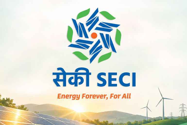
Solar Energy Corporation of India Limited (SECI) has unveiled a new corporate logo at the Bharat Renewable Energy Summit & Expo (BRESE) 2026, marking its evolution into an integrated renewable energy organisation with an expanding presence across India’s clean energy sector.
The new visual identity reflects SECI’s broader role in the renewable energy landscape, moving beyond its original focus on solar power to include wind, hybrid energy, battery energy storage systems (BESS), green hydrogen and its derivatives.
Designed by the National Institute of Design (NID), Ahmedabad, through a consultative process with SECI, the logo represents the organisation’s vision of continuous, regenerative and sustainable energy development.
The logo features rotating forms inspired by turbine blades, symbolising the expansion of India’s renewable energy infrastructure. An embedded Vajra at the centre represents power and activation, while a surrounding arrangement of leaves signifies a continuous and self-sustaining cycle of renewable energy. Its six design elements represent the sky, earth and four directions, reflecting SECI’s nationwide reach and leadership.
The colour scheme further highlights the organisation’s vision. Blue represents institutional trust, technical expertise and leadership, while green signifies sustainability and regeneration. Sunrise saffron symbolises the beginning of India’s renewable energy revolution and SECI’s role in driving innovation.
With the new identity, SECI aims to reflect its expanding responsibilities across multiple clean energy technologies and its contribution to India’s transition towards a sustainable energy future.
The organisation has adopted the tagline “Energy Forever, For All”, highlighting its vision of making clean and renewable energy accessible while supporting the country’s growing energy requirements.
 Electrify your feed! Click here to join our Whatsapp group and to get the latest updates, expert insights, and innovations driving India’s energy storage revolution.